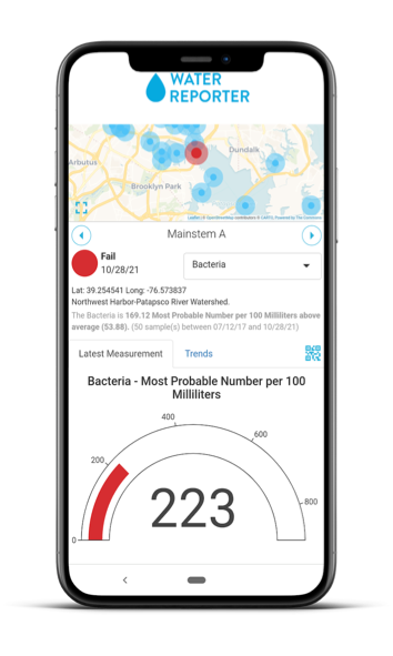
The Water Reporter Station Card gives monitoring groups an easy way to share their results at the water’s edge. Any public monitoring data collected and stored in Water Reporter can be immediately accessed by users through an easy to interpret visual via a QR Code scan. The Station Card cracks the code on how program managers can deliver timely station and parameter specific information. The core components of this new feature rely both on use of the Water Reporter API and the creation of unique URLs built to reference specific stations and parameters. It’s then wrapped in a simple yet informative visual display to quickly communicate and contextualize the data. This article examines the key visual and structural components of the feature and its intended uses for data sharing and information gathering.
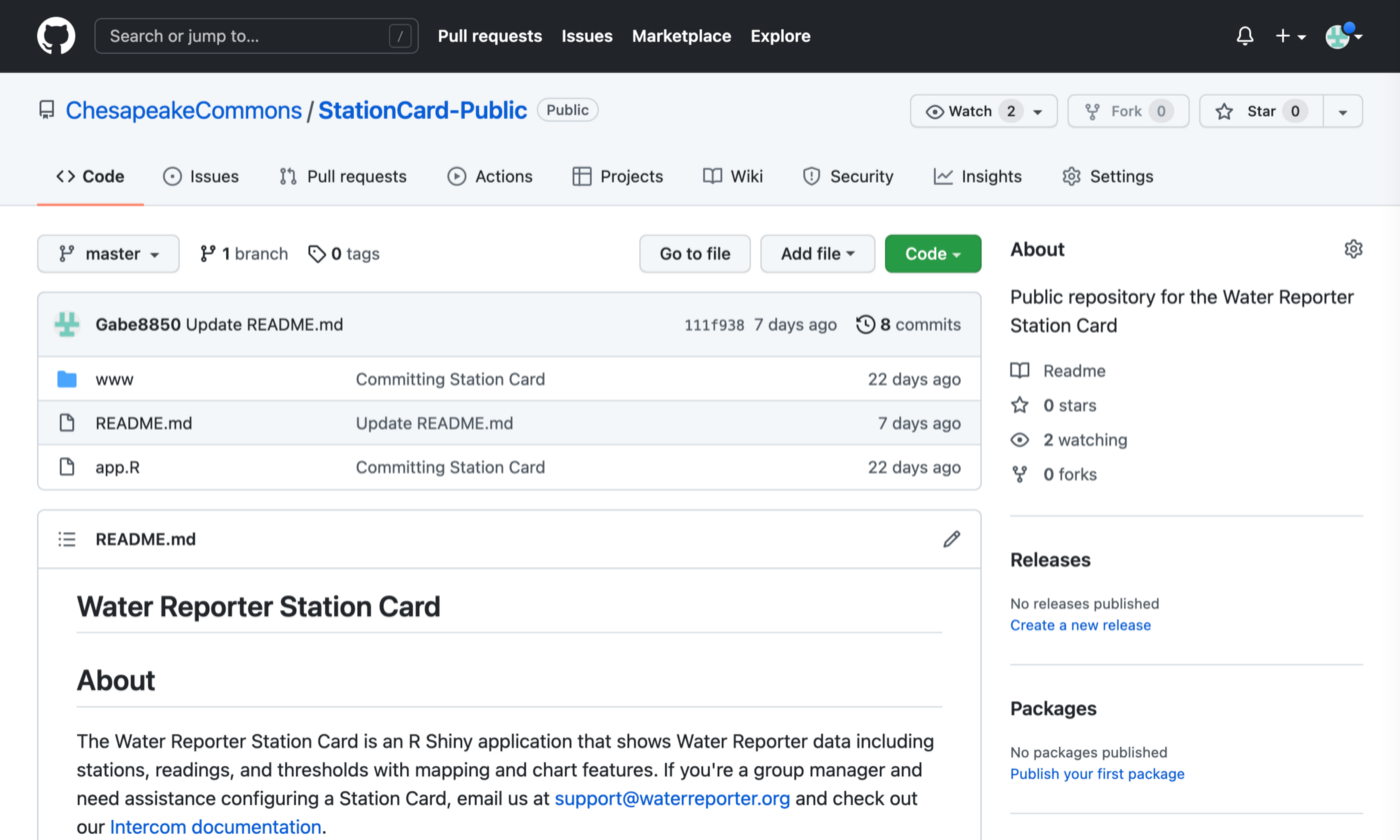
If you’d like to see the Station Card in action, go here. If you’re a developer looking to access or modify the code, you can find the Github here.

Good Visualizations Matter
At The Commons, we know the key to improving knowledge and understanding of water quality issues is delivering timely data properly contextualized in an easy-to-use and accessible format. The best data is the data that’s actually consumed, discussed, felt and trusted by users. Good visualization tools give life to the data, allowing community members and constituents to recreate and advocate with a deeper knowledge of their watershed. When our team first rolled out our beta public API, we wanted to test out possible use cases to validate the API’s structure and performance. We saw this as an opportunity to also test visualization concepts we stockpiled while doing custom application development.

We liked the outcome so much we decided to release the application as part of the Water Reporter platform. The resulting Station Card feature lets program managers share station specific information with ease through mobile-friendly visualizations. Data hosted in Water Reporter can now meet users where they are: on social media, at the water’s edge, and any other place you want to plant a QR code or embeddable link.
Key Components of the Station Card
The Station Card application uses simple visualization and mapping components to convey station status and trends with color, dynamic text, and interactive charting features. Compared to other water quality applications, the Station Card is visually lightweight and communicates information without needing multiple clicks. The Station Card is also packed with back-end features to support the mission of data providers.

The Water Reporter API creates a direct connection between water quality specialists and end users. When a sample is uploaded and approved, the analyzed results are instantly accessible to end users through the Station Card display. The application also uses the API to facilitate easy configuration in Water Reporter and the ability to share direct links to a particular station and parameter. Let’s take a closer look at the application’s features, how they work, and how to configure or modify your own Station Card.
Framework
The Station Card is built on the R Shiny framework, an ecosystem for building interactive web based applications in the statistical programming language, R. The main application is written in R and split into two sections, the Server and User Interface or UI and additional styling elements are written in CSS, HTML and Javascript. Compared to traditional web application development, like the Angular framework, R Shiny requires relatively less code and lends itself well to single-page data-oriented applications, resulting in short development timelines and a particular usefulness for research and development. Let’s look at the visual components and code that power this application.
Visual Components
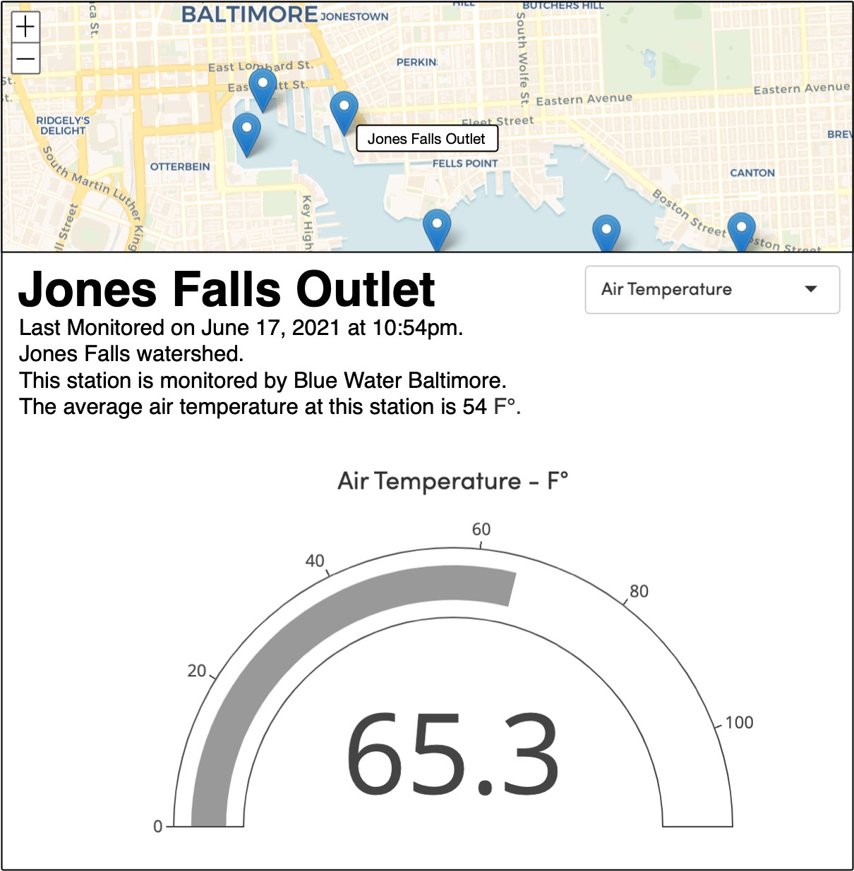
The four main visual components of the Station Card work together to communicate water quality data and contextual information to users. The Station Card visualization has four main visual components, the map, information panel, charts, and QR code modal. Each component is geared towards communicating an aspect of the data.
Map
The map is responsible for displaying the spatial data. It intuitively answers the question, “Where is the data coming from?” Users can select a new station by tapping the point on a map, or by using the forward and back arrows on the information panel. If there is threshold data configured for the selected parameter at the station, then the station point will be colored accordingly.

Information Panel
This section contains the parameter selection pulldown and is packed with contextual information about the station and current reading. As you look at the panel you will see the following:
- Station Name
- Status Dot
- Threshold and Indicator, if applicable
- Parameter
- Station Coordinates
- Status Sentence
- QR Code Icon

You will also see a sentence generated within the application that helps to place current samples in the greater context of historical trends. The application automatically generates this sentence based on the parameter, reading, number of samples, and date range. For example, the sentence above reads:
“The pH is 1.5 above average, (6.5). (12 sample(s) between 01/01/21 and 12/12/2021)”.
The status dot in the upper left corner of the information panel is colored based on the parameter threshold, if available, and also indicates if the sample is above or below average. With these components, users have multiple ways to glean not only the current reading, but also its greater context, helping to convert the data into knowledge.
QR Code
The QR code button can be found at the bottom of the information panel. Clicking it brings up a modal with the group, station, parameter name and a QR code with a link to the current view. The QR code is generated on the fly using Goqr.me and their free API. The code can be easily copied on most devices and shared digitally or printed out on cards for people to scan streamside. The QR code URL can be configured for the specific station and parameter view so watershed organizations can show the right data at the right time and place, like showing Bacteria readings at a local swimming hole.

Charts
The Station Card includes two charting elements, a gauge chart and a trends chart. The gauge chart provides an intuitive and simple representation of the current reading using the Plotly library. Just like the status dot and the station map marker, all points are colored based on the sample’s threshold status. The role of the gauge chart is simple but important: to convey the current reading. As for trends, a ggplot2 scatter plot is used. On the Y axis is the parameter value, and the X axis time. Again, each point is colored appropriately, and users can click on each point to learn the exact value. By separating the trends and current readings into different charting components, users can quickly absorb the data they need without being overwhelmed by complex charts with a multitude of views and functionality.

For users working to create their own version of the application, you may want to explore using different elements from the Plotly library.
Behind the Scenes
There are three main features working together to enable the visual components to fetch the correct data and display it appropriately: the Water Reporter API, URL key-value pairs, and dynamic sizing.
Water Reporter API and Key-Value Pairs
The Station Card depends heavily on the Water Reporter API and key-value pairs to populate the visual components. We have talked about the Water Reporter API before but let’s briefly explain key-value pairs. In a URL, you can have variables or keys, and set them to certain values, an application can then read (and edit) its own key-value pairs and react accordingly. Here is the Station Card URL with its dataset, station, and parameter keys and their corresponding value codes, separated by a ‘&’.
station-card.waterreporter.org/?dataset=1303&station=21883¶meter=2757
Modifying key-value pairs is well supported in R Shiny and integrates well with the existing application structure, creating a seamless connection between the application and the URL. When the Station Card initializes, it first reads the dataset value from the URL, and then chains the Water Reporter API dataset, station, parameter, and readings requests together to assemble the data. When a user changes a parameter or station while using the application, two things happen. First, a new reading request is sent, and second, the URL key-value pair is updated with the selected dataset, station, and parameter identifiers from Water Reporter. The link now has the new key-value pair, allowing for the link to be shared and appropriately configured on another device.
You can take advantage of the key value pair relationship to easily configure your Station Cards. You will generate the base URL within the Water Reporter Visualizations or Stations tabs and set the correct parameter in the Station Card. Using key-value pairs and the API allows for a lightweight and dynamic application that requires little configuration to serve place-specific data that is truly useful for users. More information on how to step through the default Station Card set up process can be found in our help documentation.
Dynamic Sizing
Wrapping the entire application is a bit of CSS, HTML and Javascript. These components work together to ensure consistent visual performance no matter the screen dimensions or layout. In layman’s terms, the dynamic sizing means that your Station Card will deliver nicely stylized information on any device whether it be someone looking at the data streamside on a smartphone or a curious data consumer opening a link on their desktop computer. Finally, what device you are using doesn’t put up a roadblock to accessing data.

We have R Shiny’s HTML template feature to thank for this important element. The UI side of the R shiny code passes each component to the HTML using the feature. This allows for near full control over visual component sizing and layout behavior using HTML and CSS which is more flexible than Shiny’s base layout offerings. Developing applications that work well on both mobile, desktop and all aspect ratios is crucial to allowing users on all devices to reach the data.
Pulling it All Together
The Station Card uses technologies and frameworks well established in the web development community. However, it uniquely integrates these features with dynamic water quality data and displays it with simple yet informative visualization components. All Water Reporter subscription holders can access the default version of the Station Card through their Water Reporter Data Sources. An added benefit of this application is the publicly available code in our GitHub repository. This means that you are no longer constrained by our offerings alone, and can work with a developer to re-imagine the Station Card to your specifications. If you have questions about the code, drop us a line at support@waterreporter.org.

For help configuring the default Station Card, check out our Intercom documentation. To learn more about the Water Reporter API, check out the GitHub documentation.


